CSS Components Notes
Utilities
Resizable Class
// bottom-right:
new_width = element_original_width + (mouseX - original_mouseX)
new_height = element_original_height + (mouseY - original_mouseY)

// bottom-left:
new_width = element_original_width - (mouseX - original_mouseX)
new_height = element_original_height + (mouseY - original_mouseY)
new_x = element_original_x - (mouseX - original_mouseX)

// top-right:
new_width = element_original_width + (mouseX - original_mouseX)
new_height = element_original_height - (mouseY - original_mouseY)
new_y = element_original_y + (mouseY - original_mouseY)

// top-left:
new_width = element_original_width - (mouseX - original_mouseX)
new_height = element_original_height - (mouseY - original_mouseY)
new_x = element_original_x + (mouseX - original_mouseX)
new_y = element_original_y + (mouseY - original_mouseY)
Hidden Class
display: none: 元素不在 DOM 流.visibility: hidden: 元素在 DOM 流, 隐藏不可见, 不可触发事件.opacity: 0: 元素在 DOM 流, 透明度为 0, 可触发事件.
.hidden-overflow {
  max-height: 0;
  overflow: hidden;
}

.hidden-opacity {
  position: absolute;
  filter: opacity(0%);
  opacity: 0;
}

.hidden-stacking {
  position: relative;
  z-index: -1;
}

.hidden-clip {
  position: absolute;
  clip: rect(0 0 0 0);
}

.hidden-visibility {
  position: absolute;
  visibility: hidden; /* visibility 具有继承性 */
}

.hidden-display {
  display: none;
}
Typography
Flexible Heading
h1 {
  display: flex;
  align-items: center;
  width: 100%;
}

h1::before,
h1::after {
  flex: 1;
  height: 0.1em;
  margin: 0.2em;
  content: '';
  background-color: gray;
}
Text Preset
.text-primary {
  font-family: sans-serif;
  font-size: 12px;
  font-weight: 400;
  line-height: 100px;
  color: black;
  text-decoration: none;
  text-transform: uppercase;
  letter-spacing: 1.3px;
  font-display: swap;
}
Landing Page
Jumbotron Background Image
h1 {
  background-image: url('bg.jpg');
  background-clip: text;
}

.jumbotron {
  min-height: 100%;
  background-image: url('');
  background-repeat: no-repeat;
  background-position: center center;
  background-size: cover;
  opacity: 0.8;
}
Muted Video
.fullscreen-video {
  position: absolute;
  top: 0;
  left: 0;
  z-index: -100;
  width: 100%;
  height: 100vh;
  overflow: hidden;
  background-size: cover;
}

.fullscreen-video video {
  min-width: 100%;
  min-height: 100%;
}
Search Light Effect
:root::before {
  position: fixed;
  z-index: 1000;
  display: block;
  width: 100%;
  height: 100%;
  pointer-events: none;
  content: '';
  background: radial-gradient(
    circle 16vmax at var(--cursor-x) var(--cursor-y),
    rgb(0 0 0 / 0%) 0%,
    rgb(0 0 0 / 50%) 80%,
    rgb(0 0 0 / 80%) 100%
  );
}
Navigation
Float Navigation
list-style-type: 改变ul/ol前标记类型.list-style-image: 改变ul/ol前标记类型.- 设置
<a href="#">样式.
ul {
  /* 垂直菜单设置宽度, 水平菜单不设置宽度 */
  list-style: none;
}

/* 水平菜单 */
li {
  float: left;
}

a {
  display: inline-block;
  text-decoration: none;
  cursor: pointer;
}
Inline Block Navigation
ul {
  text-align: right;
}

li {
  display: inline-block;
}
Dropdown Navigation
.anchor {
  display: none;
}

.content {
  max-height: 0;
  overflow: hidden;
  opacity: 0;
  transition:
    max-height 0.3s,
    opacity 0.3s;
}

.anchor:target ~ .content {
  max-height: 100%;
  opacity: 1;
}
Tab Navigation
.tab > a {
  position: relative;
  display: inline-block;
  padding: 0.3em 1em 0;
}

.tab > a::before {
  position: absolute;
  inset: 0;
  z-index: -1;
  background: #ccc;
  background-image: linear-gradient(
    hsl(0deg 0% 100% / 60%),
    hsl(0deg 0% 100% / 0%)
  );
  border: 1px solid rgb(0 0 0 / 40%);
  border-bottom: none;
  border-radius: 0.5em 0.5em 0 0;
  box-shadow: 0 0.15em white inset;
  transform: perspective(0.5em) rotateX(5deg);
  transform-origin: bottom;
}
Footer
Sticky Footer
- 如果页面内容不足够长时, 页脚固定在浏览器窗口的底部.
- 如果内容足够长时, 页脚固定在页面的最底部.
Negative Margin Sticky Footer
Negative bottom margin content-wrapper with fixed height footer:
<body>
  <main class="wrapper">
    content
    <div class="push"></div>
  </main>
  <footer class="footer"></footer>
</body>

<style>
  html,
  body {
    height: 100%;
    margin: 0;
  }

  .wrapper {
    min-height: 100%;

    /* Equal to height of footer */

    /* But also accounting for potential margin-bottom of last child */
    margin-bottom: -50px;
  }

  .footer,
  .push {
    height: 50px;
  }
</style>
Negative top margin on fixed height footer:
<body>
  <main class="content">
    <section class="content-inside">content</section>
  </main>
  <footer class="footer"></footer>
</body>

<style>
  html,
  body {
    height: 100%;
    margin: 0;
  }

  .content {
    min-height: 100%;
  }

  .content-inside {
    padding: 20px;
    padding-bottom: 50px;
  }

  .footer {
    height: 50px;
    margin-top: -50px;
  }
</style>
Calculation Sticky Footer
calc on fixed height footer:
<body>
  <main class="content">content</main>
  <footer class="footer"></footer>
</body>

<style>
  .content {
    min-height: calc(100vh - 70px);
  }

  .footer {
    height: 50px;
  }
</style>
Flex Sticky Footer
Use flex on body:
<body>
  <main class="content">content</main>
  <footer class="footer"></footer>
</body>

<style>
  html,
  body {
    height: 100%;
  }

  body {
    display: flex;
    flex-direction: column;
    min-height: 100vh;
  }

  .content {
    flex: 1 0 auto;
  }

  .footer {
    flex-shrink: 0;
  }
</style>
Grid Sticky Footer
Use grid on body:
<body>
  <main class="content">content</main>
  <footer class="footer"></footer>
</body>

<style>
  html {
    height: 100%;
  }

  body {
    display: grid;
    grid-template-rows: 1fr auto;
    min-height: 100%;
  }

  .footer {
    grid-row: 2 / 3;
  }
</style>
Use gird with min-content:
<body>
  <div class="grid">
    <header>
      <!-- ... -->
    </header>
    <main>
      <!-- ... -->
    </main>
    <footer>
      <!-- ... -->
    </footer>
  </div>
</body>

<style>
  .grid {
    display: grid;
    grid-template-rows: min-content auto min-content;
    height: 100vh;
  }
</style>
Link
Styled Link
a {
  padding: 2px 1px 0;
  text-decoration: none;
  outline: none;
}

a:link {
  color: #265301;
}

a:visited {
  color: #437a16;
}

a:focus {
  background: #bae498;
  border-bottom: 1px solid;
}

a:hover {
  background: #cdfeaa;
  border-bottom: 1px solid;
}

a:active {
  color: #cdfeaa;
  background: #265301;
}

a[href^='http'] {
  padding-right: 19px;
  background: url('external-link-52.png') no-repeat 100% 0;
  background-size: 16px 16px;
}
Hidden Link
a {
  text-decoration: none;
  pointer-events: none;
  cursor: default;
  opacity: 0;
}
Animated Link
Change bottom border:
a {
  position: relative;
  padding-bottom: 5px;
  color: #008080;
  text-decoration: none;
}

a::after {
  position: absolute;
  bottom: 0;
  left: 0;
  width: 0;
  height: 3px;
  content: '';
  background-color: #22313f;
  transform-origin: bottom-center;
}

a:hover,
a:focus {
  color: #22313f;
}

a:hover::after,
a:focus::after {
  width: 100%;
}
GitHub Link
<a
  href="https://github.com/Trevald/WhatTheTag.com"
  class="github-corner"
  aria-label="View source on GitHub"
>
  <svg
    width="80"
    height="80"
    viewBox="0 0 250 250"
    style="
      position: absolute;
      top: 0;
      right: 0;
      color: #2d3748;
      border: 0;
      fill: #718096;
    "
    aria-hidden="true"
  >
    <path d="M0,0 L115,115 L130,115 L142,142 L250,250 L250,0 Z" />
    <path
      d="M128.3,109.0 C113.8,99.7 119.0,89.6 119.0,89.6 C122.0,82.7 120.5,78.6 120.5,78.6 C119.2,72.0 123.4,76.3 123.4,76.3 C127.3,80.9 125.5,87.3 125.5,87.3 C122.9,97.6 130.6,101.9 134.4,103.2"
      fill="currentColor"
      style="transform-origin: 130px 106px"
      class="octo-arm"
    />
    <path
      d="M115.0,115.0 C114.9,115.1 118.7,116.5 119.8,115.4 L133.7,101.6 C136.9,99.2 139.9,98.4 142.2,98.6 C133.8,88.0 127.5,74.4 143.8,58.0 C148.5,53.4 154.0,51.2 159.7,51.0 C160.3,49.4 163.2,43.6 171.4,40.1 C171.4,40.1 176.1,42.5 178.8,56.2 C183.1,58.6 187.2,61.8 190.9,65.4 C194.5,69.0 197.7,73.2 200.1,77.6 C213.8,80.2 216.3,84.9 216.3,84.9 C212.7,93.1 206.9,96.0 205.4,96.6 C205.1,102.4 203.0,107.8 198.3,112.5 C181.9,128.9 168.3,122.5 157.7,114.1 C157.9,116.9 156.7,120.9 152.7,124.9 L141.0,136.5 C139.8,137.7 141.6,141.9 141.8,141.8 Z"
      fill="currentColor"
      class="octo-body"
    />
  </svg>
</a>
.github-corner:focus .octo-arm,
.github-corner:hover .octo-arm {
  animation: none;
}

@media (prefers-reduced-motion: no-preference) {
  .github-corner:focus .octo-arm,
  .github-corner:hover .octo-arm {
    animation: octocat-wave 560ms ease-in-out;
  }
}

@keyframes octocat-wave {
  0%,
  100% {
    transform: rotate(0);
  }

  20%,
  60% {
    transform: rotate(-25deg);
  }

  40%,
  80% {
    transform: rotate(10deg);
  }
}
Button
Link Button
a.btn-custom {
  padding: 10px 40px;
  line-height: 100px;
  text-align: center;
  background-color: #000;
  border-radius: 0;
}
Gradient Button
Linear Gradient Button
.btn {
  display: inline-block;
  padding: 5px;
  color: #333;
  text-decoration: none;
  background-image: linear-gradient(to top, #333 50%, #fff 50%);
  background-size: 100% 200%;
  transition: all 0.3s;
}

.btn:hover,
.btn:focus {
  color: #fff;
  background-position: 0 100%;
}
.btn-1 {
  background-image: linear-gradient(
    to right,
    #f6d365 0%,
    #fda085 51%,
    #f6d365 100%
  );
}

.btn-2 {
  background-image: linear-gradient(
    to right,
    #fbc2eb 0%,
    #a6c1ee 51%,
    #fbc2eb 100%
  );
}

.btn-3 {
  background-image: linear-gradient(
    to right,
    #84fab0 0%,
    #8fd3f4 51%,
    #84fab0 100%
  );
}

.btn-4 {
  background-image: linear-gradient(
    to right,
    #a1c4fd 0%,
    #c2e9fb 51%,
    #a1c4fd 100%
  );
}

.btn-5 {
  background-image: linear-gradient(
    to right,
    #ffecd2 0%,
    #fcb69f 51%,
    #ffecd2 100%
  );
}

.btn:hover,
.btn:focus {
  background-position: right center; /* change the direction of the change here */
}
Radial Gradient Button
.ripple-button {
  color: #fff;
  background-color: #2a80eb;
}

.ripple-button:active {
  background-image: radial-gradient(
    160% 100% at 50% 0%,
    hsl(0deg 0% 100% / 30%) 50%,
    hsl(0deg 0% 100% / 0%) 52%
  );
}

.colorful-button {
  color: #fff;
  background-color: #2a80eb;
  background-image: radial-gradient(
      farthest-side at bottom left,
      rgb(255 0 255/ 50%),
      transparent
    ),
    radial-gradient(
      farthest-corner at bottom right,
      rgb(255 255 50/ 50%),
      transparent
    );
}
3D Shadow Button
.shadow-3d-button {
  width: 100px;
  height: 36px;
  background-color: #f0f3f9;
  border: 1px solid #a0b3d6;
  box-shadow:
    1px 1px #afc4ea,
    2px 2px #afc4ea,
    3px 3px #afc4ea;
}

.shadow-3d-button:active {
  box-shadow:
    1px 1px #afc4ea,
    2px 2px #afc4ea;
  transform: translate(1px, 1px);
}
Button Reference
- 100 modern CSS buttons.
Table
table-layout: fixedto contain cells with same width, makes<table>behave a bit more predictably.border: 0andborder-collapse: collapseto remove border line.text-alignfor<th>/<td>text alignment.- Implement filter or pagination with
display: noneapplied to<tr>.
/**
 * `fixed` layout and `collapse` border.
 */
table {
  width: 100%;
  table-layout: fixed;
  border-collapse: collapse;
  border: 3px solid purple;
}

/**
 * Spacing and alignment.
 */
th,
td {
  padding: 12px 15px;
  text-align: left;
  border-bottom: 1px solid #e1e1e1;
}

th:first-child,
td:first-child {
  padding-left: 0;
}

th:last-child,
td:last-child {
  padding-right: 0;
}

/**
 * Control column width.
 */
thead th:nth-child(1) {
  width: 30%;
}

thead th:nth-child(2) {
  width: 20%;
}

thead th:nth-child(3) {
  width: 15%;
}

thead th:nth-child(4) {
  width: 35%;
}
Form
- 由于表单组件多为
Replaced Element, 通过 CSS 控制样式存在困难, 一般利用label/span代替input的方式, 对label与span进行核心样式控制, 对input进行辅助样式控制::disabled.:checked.:focus-visible.:focus:not(:focus-visible).:active:not(:disabled).:indeterminate.
- 隐藏
input, 用label模拟时, 需要注意表单元素的键盘可访问性:- 保持键盘访问:
不应使用
display: none/visibility: hidden隐藏input(无法键盘访问), 应使用[type="checkbox"] { position: absolute; clip: rect(0 0 0 0); }. - 修饰键盘访问:
应添加
:focus/:focus-visible伪类样式,input:focus ~ label { outline: 1px solid red; border: 1px solid red; }.
- 保持键盘访问:
不应使用
[type='radio'] {
  position: absolute;
  width: 1rem;
  height: 1rem;
  cursor: pointer;
  opacity: 0;
}

.radio-label {
  background-color: var(--color-transparent);
  border-color: var(--color-dark);
  border-radius: 999px;
}

:disabled ~ .radio-label {
  border-color: var(--color-ghost);
}

:checked ~ .radio-label {
  background-color: var(--color-primary);
  border-color: var(--color-primary);
}

:focus-visible ~ .radio-label {
  outline: 1px solid var(--color-primary);
}

:focus:not(:focus-visible) ~ .radio-label {
  border-color: var(--color-primary);
  outline: none;
}

:active:not(:disabled) ~ .radio-label {
  transform: scale(1.1);
}
Reset Form Styles
input[type='email'],
input[type='number'],
input[type='search'],
input[type='text'],
input[type='tel'],
input[type='url'],
input[type='password'],
textarea,
select {
  box-sizing: border-box;
  height: 38px;
  padding: 6px 10px;
  background-color: #fff;
  border: 1px solid #d1d1d1;
  border-radius: 4px;
  box-shadow: none;
}

/* Removes awkward default styles on some inputs for iOS */
input[type='email'],
input[type='number'],
input[type='search'],
input[type='text'],
input[type='tel'],
input[type='url'],
input[type='password'],
textarea {
  appearance: none;
}

textarea {
  min-height: 65px;
  padding-top: 6px;
  padding-bottom: 6px;
}

input[type='email']:focus,
input[type='number']:focus,
input[type='search']:focus,
input[type='text']:focus,
input[type='tel']:focus,
input[type='url']:focus,
input[type='password']:focus,
textarea:focus,
select:focus {
  /* Custom border color */
  border: 1px solid #33c3f0;

  /* Key point: remove default outline */
  outline: 2px solid transparent;
  outline-offset: 2px;
}

label,
legend {
  display: block;
  padding: 0;
  margin-bottom: 0.5rem;
  font-weight: bold;
}

fieldset {
  min-width: 0;
  padding: 0;
  margin: 0;
  border-width: 0;
}

input[type='checkbox'],
input[type='radio'] {
  display: inline;
}

label > .label-body {
  display: inline-block;
  margin-left: 0.5rem;
  font-weight: normal;
}
Custom Form Button
隐藏 <input>, 添加样式至 <label>/<span>:
<input id="submit" type="submit" />
<label class="btn" for="submit">Submit</label>

<style>
  [type='submit'] {
    position: absolute;
    clip: rect(0 0 0 0);
  }

  .btn {
    display: inline-block;
    padding: 2px 12px;
    font-size: 14px;
    color: #fff;
    cursor: pointer;
    background-color: #cd0000;
  }

  :focus + label.btn {
    outline: 1px dotted var(--highlight);
  }
</style>
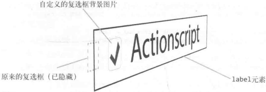
Custom Form Checkbox
Input itself as border shape, pseudo elements as center shape (checked transform animation):
input[type='checkbox'] + label::before {
  position: relative;
  display: inline-block;
  width: 20px;
  height: 20px;
  margin-right: 10px;
  content: '';
  background: white;
}

input[type='checkbox']:checked + label::before {
  background: #5ac5c9;
}

input[type='checkbox']:checked + label::after {
  position: absolute;
  top: 3px;
  left: 27px;
  width: 13px;
  height: 6px;
  content: '';
  border-bottom: 2px solid black;
  border-left: 2px solid black;
  transform: rotate(-45deg);
}

input[type='checkbox']:focus + label::before {
  outline: #5d9dd5 solid 1px;
  box-shadow: 0 0 8px #5e9ed6;
}

input[type='checkbox']:disabled + label {
  color: #575757;
}

input[type='checkbox']:disabled + label::before {
  background: #ddd;
}
Custom Form Switch
Pseudo element switch from circle to circle:
- thumb-size: 2rem.
- track-width:
2 * thumb-size. - track-height: thumb-size.
- pseudo-element border-radius: 50%.
- track border-radius: track-size.
- checked transform:
track
background-color, pseudo elementtranslateX.
.gui-switch > input {
  display: grid;
  flex-shrink: 0;
  grid: [track] 1fr / [track] 1fr;
  align-items: center;
  inline-size: var(--track-size);
  block-size: var(--thumb-size);
  padding: var(--track-padding);
  appearance: none;
  border-radius: var(--track-size);
}

.gui-switch > input::before {
  grid-area: track;
  inline-size: var(--thumb-size);
  block-size: var(--thumb-size);
  content: '';
}
Custom Form Select
.custom-select {
  width: 15%;
  height: 35px;
  margin-right: 20px;

  /* 文本属性 */
  text-align: center;
  text-align-last: center;

  /* 消除默认箭头 */
  text-indent: 0.01px;
  text-overflow: '';

  /* 消除默认样式 */
  appearance: none;

  /* 将箭头图片移至右端 */
  background: url('images/arrow.png') no-repeat;
  background-color: #fff;
  background-position: right;

  /* 自定义边框 */
  border: 0;
}

.custom-select:focus {
  border: 1px solid #e74f4d;
}

.custom-select option {
  width: 100%;
  height: 25px;
  padding-left: 30px;
  line-height: 25px;
  color: #323333;
  background-color: #fff;
  direction: rtl;
}

.custom-select option:hover,
.custom-select option:focus {
  color: #fff;
  background: url('./img/tick.png') no-repeat 8px center;
  background-color: #e74f4d;
}
Modal
Overlay Modal
.overlay {
  position: fixed;
  width: 100%;
  height: 100%;
  background: rgb(0 0 0 / 50%);
}
Box Shadow Modal
.modal {
  box-shadow: 0 0 0 50vmax rgb(0 0 0 / 80%);
}
Dialog Modal
<div class="container">
  <div class="dialog">
    <div class="content">内容占位</div>
  </div>
</div>
.container {
  position: fixed;
  inset: 0;
  z-index: 99;
  text-align: center;
  white-space: nowrap;

  /* for IE8 */
  background: url('data:image/png;base64,iVB...g==');

  /* for IE9+ */
  background: rgb(0 0 0 / 50%), none;
}

.container::after {
  display: inline-block;
  height: 100%;
  vertical-align: middle;
  content: '';
}

.dialog {
  display: inline-block;
  text-align: left;
  white-space: normal;
  vertical-align: middle;
  background-color: #fff;
  border-radius: 6px;
}
Clip Modal
图片剪裁的矩形镂空效果:
.crop {
  overflow: hidden;
}

.crop > .crop-area {
  width: 80px;
  height: 80px;
  cursor: move;
  outline: 256px solid rgb(0 0 0 / 50%);
}
Tooltip
利用伪元素 (无法选中) 生成元素, 并设置 pointer-events: none (无法交互):
.tooltip {
  position: relative;
  cursor: help;
}

/* 三角形 */
.tooltip::before {
  position: absolute;
  top: 12px;
  left: 20px;
  display: block;
  width: 0;
  height: 0;
  content: '';
  border: solid transparent 5px;
  border-bottom-color: rgb(0 0 0 / 80%);
  opacity: 0;
  transition:
    opacity 250ms,
    top 250ms;
}

/* 提示文字 */
.tooltip::after {
  position: absolute;
  top: 22px;
  left: 0;
  display: inline;
  width: 230px;
  padding: 0.5em 0.8em;
  font-size: 13px;
  font-weight: 700;
  line-height: 1.5em;
  color: #fff;
  pointer-events: none; /* This prevents the box from appearing when hovered. */
  content: attr(aria-label);
  background: rgb(0 0 0 / 80%);
  opacity: 0;
  transition:
    opacity 250ms,
    top 250ms;
}

/* Keeps the info boxes on top of other elements */
.tooltip:hover {
  z-index: 2;
}

.tooltip:hover::before,
.tooltip:hover::after {
  opacity: 1;
}

.tooltip:hover::before {
  top: 20px;
}

.tooltip:hover::after {
  top: 30px;
}
TreeView
GitHub tree view component:
<div class="tree-view-item">
  <div class="spacer"></div>
  <div class="toggle"></div>
  <div class="content">
    <div class="visual"></div>
    <span class="text">ReactART-test.js.snap</span>
  </div>
</div>

<style scoped>
  .tree-view-item {
    --toggle-width: 1rem;
    --spacer-col: calc(calc(var(--level) - 1) * (var(--toggle-width) / 2));

    display: grid;
    grid-template-areas: 'spacer toggle content';
    grid-template-columns: var(--spacer-col) var(--toggle-width) 1fr;
  }

  .spacer {
    grid-area: spacer;
  }

  .toggle {
    grid-area: toggle;
  }

  .content {
    grid-area: content;
  }
</style>
Scroll Effect
Parallax Effect
Background Attachment Parallax Effect
.parallax {
  min-height: 60%; /* key */
  background-image: url('./images/bg.jpg');
  background-repeat: no-repeat;
  background-attachment: fixed; /* key */
  background-position: center;
  background-size: cover;
}
3D Perspective Transform Parallax Effect
3D perspective transform parallax effect:
<div class="parallax">
  <div class="parallax-group">
    <div class="parallax-layer parallax-fore-layer"></div>
    <div class="parallax-layer parallax-base-layer"></div>
  </div>
  <div class="parallax-group">
    <div class="parallax-layer parallax-base-layer"></div>
    <div class="parallax-layer parallax-back-layer"></div>
    <div class="parallax-layer parallax-deep-layer"></div>
  </div>
</div>

<style>
  .parallax {
    height: 100vh;
    overflow: hidden auto;
    perspective: 1px;
    perspective-origin: 100% 50%;
  }

  .parallax-group {
    position: relative;
    height: 100vh;
    transform-style: preserve-3d;
  }

  .parallax-layer {
    position: absolute;
    inset: 0;
    transform-origin: 100% 50%;
  }

  .parallax-fore-layer {
    transform: translateZ(90px) scale(0.7);
  }

  .parallax-base-layer {
    transform: translateZ(0);
  }

  .parallax-back-layer {
    transform: translateZ(-1px) scale(2);
  }

  .parallax-deep-layer {
    transform: translateZ(-2px) scale(3);
  }
</style>
Page Progress Indicator
body {
  position: relative;
}

.indicator {
  position: absolute;
  inset: 0;
  z-index: 1;
  pointer-events: none;
  background: linear-gradient(to right top, teal 50%, transparent 50%) no-repeat;
  background-size: 100% calc(100% - 100vh);
  mix-blend-mode: darken;
}

/* use after element to hidden triangle background gradient */

/* only show 5px background */
.indicator::after {
  position: fixed;
  inset: 5px 0 0;
  z-index: 1;
  content: '';
  background: #fff;
}
Slides
锚点定位本质上改变了 scrollTop 或 scrollLeft 值,
即使容器设置 overflow: hidden 也会发生滚动,
可以利用锚点定位实现 CSS-only slides:
position: absoluteto stack slides up.id+:targetfor style current slide (change z-index).- Add animation to slide change: (prev, current, next)
.slide,.slide:target,.slide:target ~ slide. - Add
overflow: hiddento container when animation.
<main>
  <section class="slide" id="slide1">
    <a class="slide-link" href="#slide2">next</a>
  </section>
  <section class="slide" id="slide2">
    <a class="slide-link" href="#slide1">prev</a>
    <a class="slide-link" href="#slide3">next</a>
  </section>
  <section class="slide" id="slide3">
    <a class="slide-link" href="#slide2">prev</a>
    <a class="slide-link" href="#slide4">next</a>
  </section>
  <section class="slide" id="slide4">
    <a class="slide-link" href="#slide3">prev</a>
    <a class="slide-link" href="#slide5">next</a>
  </section>
  <section class="slide" id="slide5">
    <a class="slide-link" href="#slide4">prev</a>
  </section>
</main>
body {
  overflow: hidden; /* key 1 */
}

.slide {
  position: absolute; /* key 2 */
  z-index: 0; /* key 3 */
  box-sizing: border-box;
  width: 100%;
  height: 100vh;
}

.slide:target {
  z-index: 1; /* key 4 */
}
/* Rotate Fade-In Animation */
@media only screen and (prefers-reduced-motion: reduce) {
  .slide {
    transition: none;
  }
}

.slide {
  z-index: 0;
  transition:
    transform 1s,
    opacity 0.8s;
  transform: rotate(90deg);
  transform-origin: 0 0;
}

.slide:target {
  z-index: 1;
  transform: rotate(0deg);
}

.slide:target ~ section {
  opacity: 0;
  transform: rotate(-90deg);
}
当两个 width: 100% slide 同时处于同一水平位置,
添加左进/右进动画, 当 slide 向右滑动时,
水平的 scrollX 会直接滑到最右边,
导致幻灯片浏览异常.
解决办法
如下:
function resetScrollX() {
  window.scrollTo(0, 0)
}
Gallery
.gallery {
  display: grid;
  grid-template-columns: repeat(auto-fill, minmax(200px, 1fr));
  grid-auto-rows: 1fr;
  grid-auto-flow: dense;
  grid-gap: 1em;
}

.gallery .featured {
  grid-row: span 2;
  grid-column: span 2;
}

.gallery figure {
  display: flex;
  flex-direction: column;
  margin: 0;
}

.gallery img {
  flex: 1;
  max-width: 100%;
  object-fit: cover;
}

Timeline and Steps
Use pseudo elements to construct circle and line:
/* The separator line */
.c-timeline-item:not(:last-child) .c-timeline-content::before {
  position: absolute;
  top: 0;
  right: 100%;
  width: 2px;
  height: 100%;
  content: '';
  background-color: #d3d3d3;
}

/* The circle */
.c-timeline-content::after {
  position: absolute;
  top: 0;
  left: -12px;
  z-index: 1;
  width: 20px;
  height: 20px;
  content: '';
  background-color: #fff;
  border: 2px solid #d3d3d3;
  border-radius: 50%;
}
Background and Shadow
Gradient Border
.gradient-border {
  width: 200px;
  height: 100px;
  margin: auto;
  clip-path: inset(0 round 10px);
  filter: hue-rotate(360deg);
  border: 10px solid;
  border-image: linear-gradient(45deg, gold, deeppink) 1;
  animation: hue 6s infinite linear;
}

@keyframes hue {
  0% {
    filter: hue-rotate(0deg);
  }

  100% {
    filter: hue-rotate(360deg);
  }
}
Gradient Box Shadow
.box::before {
  position: absolute;
  inset: 0;
  z-index: -1;
  content: '';
  background: linear-gradient(-45deg, #ff3d00 0%, #0400ff 100%);
  filter: blur(20px);
  border-radius: inherit;
  opacity: var(0.7);
  transition: opacity 0.3s;
  transform: translate3d(0, 20px, 0) scale(0.95);
}

/**
 * Prevents issues when the parent creates a  stacking context:
 * For example, using the `transform` property.
 */
.box::after {
  position: absolute;
  inset: 0;
  z-index: -1;
  content: '';
  background: inherit;
  border-radius: inherit;
}
Geometry and Shape
Pseudo Element Shape
.first-details-intro::after {
  position: absolute;
  top: 50%;
  right: 0;
  width: 0;
  height: 0;
  content: '';
  border-top: 15px solid transparent;
  border-right: 25px solid #fff;
  border-bottom: 15px solid transparent;
}
Border Shape
Horizontal and Vertical Border
Separate set horizontal and vertical radius to make well-designed shapes:
.avatar-shape {
  border-radius: 70% 30% 30% 70% / 60% 40% 60% 40%;
}

.avatar {
  width: 100px;
  height: 100px;
  object-fit: cover;
  border: solid deepskyblue;
  border-radius: 50%;
  animation: morph 6s paused linear;
}

@keyframes morph {
  0% {
    border-radius: 40% 60% 60% 40% / 60% 30% 70% 40%;
    transform: rotate(-5deg);
  }

  100% {
    border-radius: 40% 60%;
    transform: rotate(5deg);
  }
}

.avatar:nth-child(4n) {
  animation-delay: -3.5s;
}

.avatar:nth-child(2n + 1) {
  animation-delay: -1s;
}

.avatar:nth-child(3n + 2) {
  animation-delay: -2s;
}

.avatar:nth-child(5n + 3) {
  animation-delay: -3s;
}

.avatar:nth-child(7n + 5) {
  animation-delay: -4s;
}

.avatar:nth-child(11n + 7) {
  animation-delay: -5s;
}
Transparent Border
Mix transparent with non-transparent border to make shapes (e.g. triangle):
.arrow-up {
  width: 0;
  height: 0;
  border-right: 16px solid transparent;
  border-bottom: 20px solid #8888e8;
  border-left: 16px solid transparent;
}

.arrow-right {
  width: 0;
  height: 0;
  border-top: 16px solid transparent;
  border-bottom: 16px solid transparent;
  border-left: 20px solid #e888a3;
}

.arrow-down {
  width: 0;
  height: 0;
  border-top: 20px solid #f7df6c;
  border-right: 16px solid transparent;
  border-left: 16px solid transparent;
}

.arrow-left {
  width: 0;
  height: 0;
  border-top: 16px solid transparent;
  border-right: 20px solid #8de698;
  border-bottom: 16px solid transparent;
}
Background Shape
.btn-add,
.btn-sub {
  width: 1.5rem;
  height: 1.5rem;
  color: dimgray;
  background:
    linear-gradient(currentcolor, currentcolor) no-repeat center / 0.875em 2px,
    linear-gradient(currentcolor, currentcolor) no-repeat center / 2px 0.875em;
  border: 1px solid gray;
}

.btn-sub {
  background-size:
    0.875em 2px,
    0;
}
.square {
  width: 304px;
  height: 160px;
  background-color: #fff;
  background-image: linear-gradient(
      45deg,
      #eee 25%,
      transparent 25%,
      transparent 75%,
      #eee 75%
    ),
    linear-gradient(45deg, #eee 25%, transparent 25%, transparent 75%, #eee 75%);
  background-position:
    0 0,
    8px 8px;
  background-size: 16px 16px;
}

Stretch Line
backgroundline.borderline.- Pseudo element with
line-throughtext-decoration.
.line {
  width: 70%;
  height: 10px;
  background-color: #000;
}

.line,
.line-background {
  background: linear-gradient(#000, #000) 50% / 70% 10px no-repeat;
}

.line,
.line-border {
  border-top: 10px solid #000;
}

.line,
.line::after {
  /* set thickness */
  font-size: 5em;

  /* hide content */
  color: transparent;
  text-decoration: line-through #000;

  /* control line length */
  content: '_______';
}
Dash Line
backgrounddash line.borderdash line.- Pseudo element with
dashedtext-decoration.
.dash-background {
  background: linear-gradient(to left, #000 70%, transparent 0);
  background-repeat: repeat-x;
  background-size: 30px 10px;
}

.dash-border {
  border-top: 10px dashed #000;
}

.dash::after {
  text-decoration-style: dashed;
}
Bar Line
Background gradient bar:
.bars {
  --color: no-repeat linear-gradient(#000 0 0);

  width: 45px;
  aspect-ratio: 1;
  background:
    var(--color) 0% 50%,
    var(--color) 50% 50%,
    var(--color) 100% 50%;
  background-size: 20% 100%; /* 20% * (3 bars + 2 spaces) = 100% */
}
Grid pseudo element border bar:
.loader {
  --size: 100px; /* control the size */

  display: grid;
  place-content: center;
  place-items: center;
  margin: 0 calc(var(--size) / 2); /* 50px */
}

.loader::before,
.loader::after {
  grid-area: 1 / 1;
  content: '';
}

.loader,
.loader::before,
.loader::after {
  width: calc(var(--size) / 5); /* 20px */
  height: var(--size);
  border-radius: var(--size);
  transform: translate(calc(var(--index, 0) * 200%));
}

.loader::before {
  --index: -1;
}

.loader::after {
  --index: 1;
}
Wave line
Rotate border wave:
<div class="container">
  <div class="wave"></div>
  <p>45%</p>
</div>

<style>
  .container {
    width: 200px;
    height: 200px;
    overflow: hidden;
    border-radius: 50%;
  }

  .wave {
    position: relative;
    width: 200px;
    height: 200px;
    background-color: rgb(118 218 255);
    border-radius: 50%;
  }

  .wave::before,
  .wave::after {
    position: absolute;
    top: 0;
    left: 50%;
    z-index: 1;
    width: 400px;
    height: 400px;
    content: '';
    background-color: rgb(255 255 255 / 40%);
    border-radius: 45%;
    transform: translate(-50%, -70%) rotate(0);
    animation: rotate 6s linear infinite;
  }

  .wave::after {
    z-index: 2;
    background-color: rgb(255 255 255 / 90%);
    border-radius: 47%;
    transform: translate(-50%, -70%) rotate(0);
    animation: rotate 10s linear -5s infinite;
  }

  @keyframes rotate {
    50% {
      transform: translate(-50%, -73%) rotate(180deg);
    }

    100% {
      transform: translate(-50%, -70%) rotate(360deg);
    }
  }
</style>
Menu Line
.icon-menu {
  display: inline-block;
  width: 140px;
  height: 10px;

  /* Line gap */
  padding: 35px 0;

  /* Line 2 */
  background-color: currentcolor;
  background-clip: content-box;

  /* Line 1 */
  border-top: 10px solid;

  /* Line 3 */
  border-bottom: 10px solid;
}
Grid Line
background-imagefor line color,background-sizefor line gap.
.grid-line {
  background-color: #fff;
  background-image: linear-gradient(var(--line-color) 1px, transparent 0),
    linear-gradient(90deg, var(--line-color) 1px, transparent 0);
  background-size: 10px 10px;
  border-top: 1px solid #e5e8eb;
  border-bottom: 1px solid #e5e8eb;
  box-shadow:
    inset 0 15px 20px -15px #f6f7f9,
    inset -5px -15px 20px -15px #f6f7f9;
}

/**
 * @see {@link play.csssecrets.io/blueprint}
 */
.nest-grid-line {
  background: #58a;
  background-image: linear-gradient(
      var(--primary-line-color) 2px,
      transparent 0
    ),
    linear-gradient(90deg, var(--primary-line-color) 2px, transparent 0),
    linear-gradient(var(--secondary-line-color) 1px, transparent 0),
    linear-gradient(90deg, var(--secondary-line-color) 1px, transparent 0);
  background-size:
    75px 75px,
    75px 75px,
    15px 15px,
    15px 15px;
}
Spinner
- Rotate conic gradient.
- Rotate border.
Background gradient loading spinner:
.loading-ring {
  --mask: radial-gradient(closest-side, transparent 75%, black 76%);

  width: 100px;
  height: 100px;
  background: conic-gradient(deepskyblue, 30%, white);
  border-radius: 50%;
  mask-image: var(--mask);
  animation: spin 1s linear infinite reverse;
}

@keyframes spin {
  from {
    transform: rotate(0deg);
  }

  to {
    transform: rotate(360deg);
  }
}
More spinner see SpinKit.
Dot
Border Dot
background and border dot:
.icon-dot {
  display: inline-block;
  width: 100px;
  height: 100px;

  /* Cycle gap */
  padding: 10px;

  /* Cycle shape */
  background-color: currentcolor;
  background-clip: content-box;

  /* Cycle ring */
  border: 10px solid;
  border-radius: 50%;
}
Gradient Dot
/**
 * @see {@link play.csssecrets.io/polka}
 */
.dot {
  background: #655;
  background-image: radial-gradient(tan 30%, transparent 0);
  background-size: 30px 30px;
}
repeating-radial-gradient dot:
@property --length {
  syntax: '<length>';
  inherits: false;
  initial-value: 0.0008px;
}

/* TV snowflake noise signal screen effect (雪花屏效果) */
div {
  background-image: repeating-radial-gradient(
    circle at 17% 32%,
    rgb(4 4 0),
    rgb(52 72 197),
    rgb(115 252 224),
    rgb(116 71 5),
    rgb(223 46 169),
    rgb(0 160 56),
    rgb(234 255 0) var(--length)
  );
  animation: change 1s infinite alternate;
}

@keyframes change {
  100% {
    --length: 0.0009px;
  }
}
Circle
backgroundcircle.bordercircle.clip-pathcircle.- Pseudo element circle.
.circle-background {
  background-image: radial-gradient(#000 72%, transparent 0);
}

.circle-background-corner {
  background: #58a;
  background:
    radial-gradient(circle at top left, transparent 15px, #58a 0) top left,
    radial-gradient(circle at top right, transparent 15px, #58a 0) top right,
    radial-gradient(circle at bottom right, transparent 15px, #58a 0) bottom
      right,
    radial-gradient(circle at bottom left, transparent 15px, #58a 0) bottom left;
  background-repeat: no-repeat;
  background-size: 50% 50%;
}

.circle-border {
  overflow: hidden;
  border-radius: 50%;
}

.circle-clip-path {
  clip-path: circle(50%);
}

.circle::after {
  font-size: 120vw;
  line-height: 0;
  content: '·';
}
Ellipse
/**
 * @see {@link play.csssecrets.io/half-ellipse}
 * @see {@link play.csssecrets.io/quarter-ellipse}
 */
.ellipse {
  border-radius: 50% / 50%;
  border-radius: 50% / 100% 100% 0 0;
  border-radius: 50% / 0 0 100% 100%;
  border-radius: 100% 0 0 100% / 50%;
  border-radius: 0 100% 100% 0 / 50%;
  border-radius: 100% 0 0;
  border-radius: 0 100% 0 0;
  border-radius: 0 0 100%;
  border-radius: 0 0 0 100%;
}

Triangle
backgroundtriangle.bordertriangle.clip-pathtriangle.- Pseudo element triangle.
Background gradient triangle:
.triangle {
  background: linear-gradient(45deg, #000 50%, transparent 0);
}

/**
 * @see {@link https://codepen.io/Chokcoco/pen/BGeJGm}
 */
.arrow {
  position: absolute;
  top: 50%;
  left: 50%;
  width: 200px;
  height: 40px;
  font-size: 200%;
  color: white;
  text-align: center;
  background:
    linear-gradient(-135deg, transparent 10%, #04e6fb 10%, #65ff9a 100%) top
      right,
    linear-gradient(-45deg, transparent 10%, #04e6fb 10%, #65ff9a 100%) bottom
      right,
    linear-gradient(-135deg, #04e6fb 0, #65ff9a 90%, transparent 90%) top left,
    linear-gradient(-45deg, #04e6fb 0, #65ff9a 90%, transparent 90%) bottom left;
  background-repeat: no-repeat;
  background-size: 90% 50%;
  transform: translate(-50%, -50%);
}

/**
 * @see {@link play.csssecrets.io/folded-corner-realistic}
 */
.note {
  position: relative;
  background: #58a; /* 回退样式 */
  background: linear-gradient(-150deg, transparent 1.5em, #58a 0);
}

.note::before {
  position: absolute;
  top: 0;
  right: 0;
  width: 1.73em;
  height: 3em;
  content: '';
  background: linear-gradient(
      to left bottom,
      transparent 50%,
      rgb(0 0 0 / 20%) 0,
      rgb(0 0 0 / 40%)
    )
    100% 0 no-repeat;
  transform: translateY(-1.3em) rotate(-30deg);
  transform-origin: bottom right;
}
Border triangle:
/* transparent border */
.arrow-up {
  width: 0;
  height: 0;
  border-right: 16px solid transparent;
  border-bottom: 20px solid #8888e8;
  border-left: 16px solid transparent;
}
Clip path triangle:
/* clip path */
.arrow-right {
  width: 20px;
  height: 32px;
  clip-path: polygon(0 0, 0 100%, 100% 50%);
  background-color: #e888a3;
}
Pseudo element triangle:
/* pseudo element + hidden overflow */
.arrow-down {
position: relative;
width: 40px;
height: 40px;
overflow: hidden;
}
.arrow-down::before {
position: absolute;
top: 0;
left: 0;
display: block;
width: calc(40px / 1.41);
height: calc(40px / 1.41);
content: '';
background: #f7df6c;
transform: rotate(-45deg);
transform-origin: 0 0;
}
/**
* pseudo element + HTML5 entities:
* ◄ : ◄
* ► : ►
* ▼ : ▼
* ▲ : ▲
*/
.arrow::before {
content: '▼';
}
Square
Background gradient square shape:
.checkerboard-linear-gradient {
  background: #eee;
  background-image: linear-gradient(
      45deg,
      rgb(0 0 0 / 25%) 25%,
      transparent 0 75%,
      rgb(0 0 0 / 25%) 0
    ),
    linear-gradient(
      45deg,
      rgb(0 0 0 / 25%) 25%,
      transparent 0 75%,
      rgb(0 0 0 / 25%) 0
    );
  background-position:
    0 0,
    15px 15px;
  background-size: 30px 30px;
}

.checkerboard-conic-gradient {
  background: repeating-conic-gradient(#bbb 0, #bbb 25%, #eee 0, #eee 50%);
  background-size: 30px 30px;
}
Polygon
Gradient Polygon
Background gradient polygon:
/**
 * @see {@link play.csssecrets.io/bevel-corners-gradients}
 */
.polygon-background-corner {
  background: #58a;
  background:
    linear-gradient(135deg, transparent 15px, #58a 0) top left,
    linear-gradient(-135deg, transparent 15px, #58a 0) top right,
    linear-gradient(-45deg, transparent 15px, #58a 0) bottom right,
    linear-gradient(45deg, transparent 15px, #58a 0) bottom left;
  background-repeat: no-repeat;
  background-size: 50% 50%;
}
Clip Path Polygon
clip-path polygon:
.polygon {
  /* 菱形 */
  clip-path: polygon(50% 0, 100% 50%, 50% 100%, 0 50%);

  /* 矩形箭头 */
  clip-path: polygon(75% 0%, 100% 50%, 75% 100%, 0% 100%, 25% 50%, 0% 0%);

  /* 八边形 */
  clip-path: polygon(
    20px 0,
    calc(100% - 20px) 0,
    100% 20px,
    100% calc(100% - 20px),
    calc(100% - 20px) 100%,
    20px 100%,
    0 calc(100% - 20px),
    0 20px
  );
}
function polygon(n = 3) {
  const deg = (2 * Math.PI) / n
  const points = []

  for (let i = 0; i < n; ++i) {
    const theta = deg * i
    const x = `${50 * Math.cos(theta) + 50}%`
    const y = `${50 * Math.sin(theta) + 50}%`
    points.push(`${x} ${y}`)
  }

  return `polygon(${points.join(',')})`
}
Transform Polygon
transform polygon:
/* 平行四边形 */
.button::before {
  position: absolute;
  inset: 0;
  z-index: -1;
  content: ''; /* 用伪元素来生成一个矩形 */
  background: #58a;
  transform: skew(45deg);
}
/* 梯形 */
.tab::before {
  position: absolute;
  inset: 0;
  z-index: -1;
  content: ''; /* 用伪元素来生成一个矩形 */
  background: #58a;
  transform: scaleY(1.3) perspective(0.5em) rotateX(5deg);
  transform-origin: bottom;
}
Filter and Blend Effects
Dark Mode Effect
html[theme='dark'] {
  filter: invert(1) hue-rotate(180deg);
}

html[theme='dark'] img {
  filter: invert(1) hue-rotate(180deg);
}

html {
  transition:
    color 300ms,
    background-color 300ms;
}
Fusion Effect
- Parent element:
background-color+filter: contrast(). - Child element:
filter: blur().
Light, flame, rain drop emulation:
<div class="container">
  <div class="circle circle-1"></div>
  <div class="circle circle-2"></div>
</div>

<style>
  .container {
    background: #fff; /* Required */
    filter: contrast(30);
  }

  .circle {
    filter: blur(10px);
  }
</style>
Frosted Glass Effect
毛玻璃效果 (bg-white/30 shadow-lg backdrop-blur-sm):
body {
  background-image: url('https://images.unsplash.com/image');
  background-position: center;
}

.card {
  background-color: rgb(17 25 40 / 54%);
  backdrop-filter: blur(12px) saturate(200%);
  border: 1px solid rgb(255 255 255 / 12.5%);
  border-radius: 12px;
}

.hero {
  --inset-shadow: inset 0 0 1px 1px hsl(204deg 100% 90% / 100%);
  --shadow: 10px 10px 60px 20px hsl(194deg 100% 9% / 50%);

  background-color: hsl(27deg 10% 90% / 90%);
  border: 1px solid hsl(176deg 87% 7% / 60%);
  border-radius: 5px;
  box-shadow: var(--inset-shadow), var(--shadow);
}

@supports (backdrop-filter: blur(25px) brightness(170%)) {
  .hero {
    background-color: hsl(27deg 10% 90% / 50%);
    backdrop-filter: blur(25px) brightness(170%);
  }
}
Gradient Text Effect
.gradient-text {
  position: relative;
  color: black;
  background: #fff;
}

.gradient-text::before {
  position: absolute;
  inset: 0;
  content: '';
  background: linear-gradient(to right, deepskyblue, deeppink);
  mix-blend-mode: lighten;
}

.gradient-stroked-text {
  position: relative;
  color: #191325;
  text-shadow:
    1px 1px #fff,
    -1px -1px #fff,
    1px -1px #fff,
    -1px 1px #fff;
  background: #191325;
}

.gradient-stroked-text::after {
  position: absolute;
  inset: 0;
  content: '';
  background: linear-gradient(315deg, #78e56c, #127ac9);
  mix-blend-mode: darken;
}

/**
 * @see {@link https://codepen.io/Chokcoco/pen/jOwEqvR}
 */
.gradient-wave-text {
  position: relative;
  overflow: hidden;
  font-size: 120px;
  font-weight: bold;
  color: #000;
  background: #fff;
}

.gradient-wave-text::before,
.gradient-wave-text::after {
  position: absolute;
  top: -923px;
  left: 50%;
  z-index: 1;
  width: 2000px;
  height: 2000px;
  content: '';
  background: rgb(3 169 244 / 85%);
  border-radius: 45% 48% 43% 47%;
  mix-blend-mode: lighten;
  transform: translate(-50%, -50%);
  animation: rotate 10s infinite linear;
}

.gradient-wave-text::after {
  border-radius: 43% 47% 44% 48%;
  animation: rotate 10s infinite 0.5s linear;
}

@keyframes rotate {
  0% {
    transform: translate(-50%, -50%) rotate(0);
  }

  100% {
    transform: translate(-50%, -50%) rotate(360deg);
  }
}
Sun Effect
.sun-rise {
  filter: contrast(0.34) brightness(1.6) sepia(1) hue-rotate(10deg);
  filter: sepia(1) saturate(4) hue-rotate(295deg);
}
Night Effect
.night {
  background: rgb(0 40 140 / 60%), url('./house-bed.jpg');
  filter: brightness(80%) grayscale(20%) contrast(1.2);
  background-size: 100%;
  background-blend-mode: darken;
}
Movie Effect
.movie {
  filter: contrast(1.1);
  background-blend-mode: soft-light;
}
Old Effect
.old-1977 {
  position: relative;
  filter: contrast(1.1) brightness(1.1) saturate(1.3);
}

.old-1977::after {
  position: absolute;
  top: 0;
  left: 0;
  width: 100%;
  height: 100%;
  pointer-events: none;
  content: '';
  background: rgb(243 106 188 / 30%);
  mix-blend-mode: screen;
}
Sketch Effect
.sketch {
  width: 256px;
  height: 171px;
  background:
    url('10.jpg') -2px -2px,
    url('10.jpg');
  filter: brightness(3) invert(1) grayscale(1);
  background-size: 258px 173px;
  background-blend-mode: difference;
}
Animation
Animated Dots
.dot {
  display: inline-block;
  height: 1em;
  overflow: hidden;
  line-height: 1;
  text-align: left;
  vertical-align: -0.25ex;
}

@media only screen and (prefers-reduced-motion: no-preference) {
  .dot::before {
    animation: dot1 3s infinite step-start both;
  }
}

.dot::before {
  display: block;
  white-space: pre-wrap;
  content: '...\A..\A.';
}

@keyframes dot1 {
  33% {
    transform: translateY(-2em);
  }

  66% {
    transform: translateY(-1em);
  }
}
Hover Animation
- Hover button effects using background.
- Hover button effects using text shadow.
- Hover button effects using clip and mask.
Fade Animation
Visual Fade Animation
.dropdown-drawer {
  visibility: hidden;
  opacity: 0;
  transition:
    opacity 0.2s linear,
    visibility 0s linear 0.2s;
}

.is-open .dropdown-drawer {
  visibility: visible;
  opacity: 1;
  transition-delay: 0s;
}
Fade In Animation
@keyframes fade-in {
  from {
    opacity: 0;
    transform: rotateX(-90deg);
  }

  to {
    opacity: 1;
    transform: rotateX(0deg);
  }
}
Fade In Out Animation
@keyframes fade-in-out {
  0% {
    opacity: 0;
  }

  50% {
    opacity: 1;
  }

  100% {
    opacity: 0;
  }
}
Fade Mask Animation
p {
  margin: auto;
  font-family: 'Reggae One', cursive;
  font-size: 48px;
  color: #fff;
  mask: radial-gradient(circle at 0 50%, #000, transparent 10%, transparent 0);
  mask-size: 100%;
  animation: scale 5s infinite;
}

.radial {
  mask: radial-gradient(circle at 50% 0, #000, transparent 20%, transparent 0);
  mask-size: 100% 100%;
  animation: scale 5s infinite;
}

@keyframes scale {
  50%,
  100% {
    mask-size: 100% 2000%;
  }
}
Bounce Animation
/* transform-origin: top center */
@keyframes bounce-in {
  0% {
    opacity: 0;
    transform: scale(0.5) translateY(-30px);
  }

  80% {
    opacity: 1;
    transform: scale(1.2);
  }

  100% {
    opacity: 1;
    transform: rotateY(0) translateY(0);
  }
}
Rotate Animation
Rotate In Animation
/* transform-origin: top center */
@keyframes horizontal-rotate-in {
  0% {
    opacity: 0;
    transform: rotateY(-90deg) translateY(30px);
  }

  100% {
    opacity: 1;
    transform: rotateY(0) translateY(0);
  }
}

/* transform-origin: top right */
@keyframes rotate-right-in {
  0% {
    opacity: 0;
    transform: rotate(-30deg) translateX(30px);
  }

  100% {
    opacity: 1;
    transform: rotate(0) translateX(0);
  }
}
Circular Spin Animation
/**
 * @see {@link play.csssecrets.io/circular}
 */
@keyframes spin {
  from {
    transform: rotate(0turn) translateY(-150px) translateY(50%) rotate(1turn);
  }

  to {
    transform: rotate(1turn) translateY(-150px) translateY(50%) rotate(0turn);
  }
}

.avatar {
  width: 50px;
  overflow: hidden;
  border-radius: 50%;
  animation: spin 3s infinite linear;
}
Fold Flip Animation
/* transform-origin: top center */
@keyframes fold-flip {
  0% {
    opacity: 0;
    transform: rotateX(-90deg);
  }

  60% {
    transform: rotateX(50deg);
  }

  100% {
    opacity: 1;
    transform: rotateX(0);
  }
}
Accordion Animation
@media only screen and (prefers-reduced-motion: reduce) {
  .menu {
    transition: none;
  }
}

.menu {
  max-height: 0;
  overflow: hidden;
  opacity: 0;
  transition:
    max-height 0.3s,
    opacity 0.3s;
}

.menu:focus-within,
.container:hover .menu {
  max-height: 1em;
  opacity: 1;
}
Slides Animation
.slide {
  width: 500%;
  overflow: hidden;
}

@keyframes slide {
  0% {
    margin-left: 0;
  }

  10% {
    margin-left: 0;
  }

  12% {
    margin-left: -100%;
  }

  22% {
    margin-left: -100%;
  }

  24% {
    margin-left: -200%;
  }

  34% {
    margin-left: -200%;
  }

  36% {
    margin-left: -300%;
  }

  46% {
    margin-left: -300%;
  }

  48% {
    margin-left: -400%;
  }

  58% {
    margin-left: -400%;
  }

  60% {
    margin-left: -300%;
  }

  70% {
    margin-left: -300%;
  }

  72% {
    margin-left: -200%;
  }

  82% {
    margin-left: -200%;
  }

  84% {
    margin-left: -100%;
  }

  94% {
    margin-left: -100%;
  }

  96% {
    margin-left: 0;
  }
}
Scale Up Animation
@media only screen and (prefers-reduced-motion: reduce) {
  .div {
    transition: none;
  }
}

.div {
  transition: transform 0.5s ease;
  transform: scaleX(0);
}

.div:hover,
.div:focus {
  transform: scaleX(1);
}
Clear Splash Animation
.cube {
  transform: translate3d(0, 0, 0);
  perspective: 1000;
  backface-visibility: hidden;
  transform-style: preserve-3d;
}
Tooltip Animation
@keyframes tooltip {
  0% {
    opacity: 0;
    transform: scale(0.1) rotate(30deg) translateY(50px) rotateX(90deg);
  }

  50% {
    opacity: 1;
    transform: rotate(-10deg) rotateX(-2deg);
  }

  70% {
    transform: rotate(3deg);
  }

  100% {
    transform: scale(1);
  }
}
Breath Animation
.breath {
  animation: breath 7s infinite;
}

@keyframes breath {
  0%,
  100% {
    opacity: 0;
  }

  70% {
    opacity: 1;
  }
}
Pulse Animation
@keyframes radial-pulse {
  0% {
    box-shadow: 0 0 0 0 rgb(0 0 0 / 50%);
  }

  100% {
    box-shadow: 0 0 0 30px rgb(0 0 0 / 0%);
  }
}

/* origin opacity is 0 */
@keyframes pulse {
  0% {
    opacity: 1;
    transform: scale(0);
  }

  100% {
    opacity: 0;
    transform: scale(1.3);
  }
}
Clock Animation
.clock-pendulum {
  transform-origin: top;
  animation: pendulum 1s infinite alternate ease-in-out;
}

@keyframes pendulum {
  0% {
    transform: rotate(-10deg);
  }

  100% {
    transform: rotate(10deg);
  }
}
Typing Animation
@keyframes typing {
  from {
    width: 0;
  }
}

@keyframes caret {
  50% {
    border-right-color: transparent;
  }
}

h1 {
  width: 15ch;
  overflow: hidden;
  font:
    bold 200% Consolas,
    Monaco,
    monospace;
  white-space: nowrap;
  border-right: 0.05em solid;
  animation:
    typing 8s steps(15),
    caret 1s steps(1) infinite;
}
CSS Components Reference
- CSS tricks.
- CSS inspiration.
- Gallery for background patterns.
- Modern CSS shapes.
- Pure CSS icons.